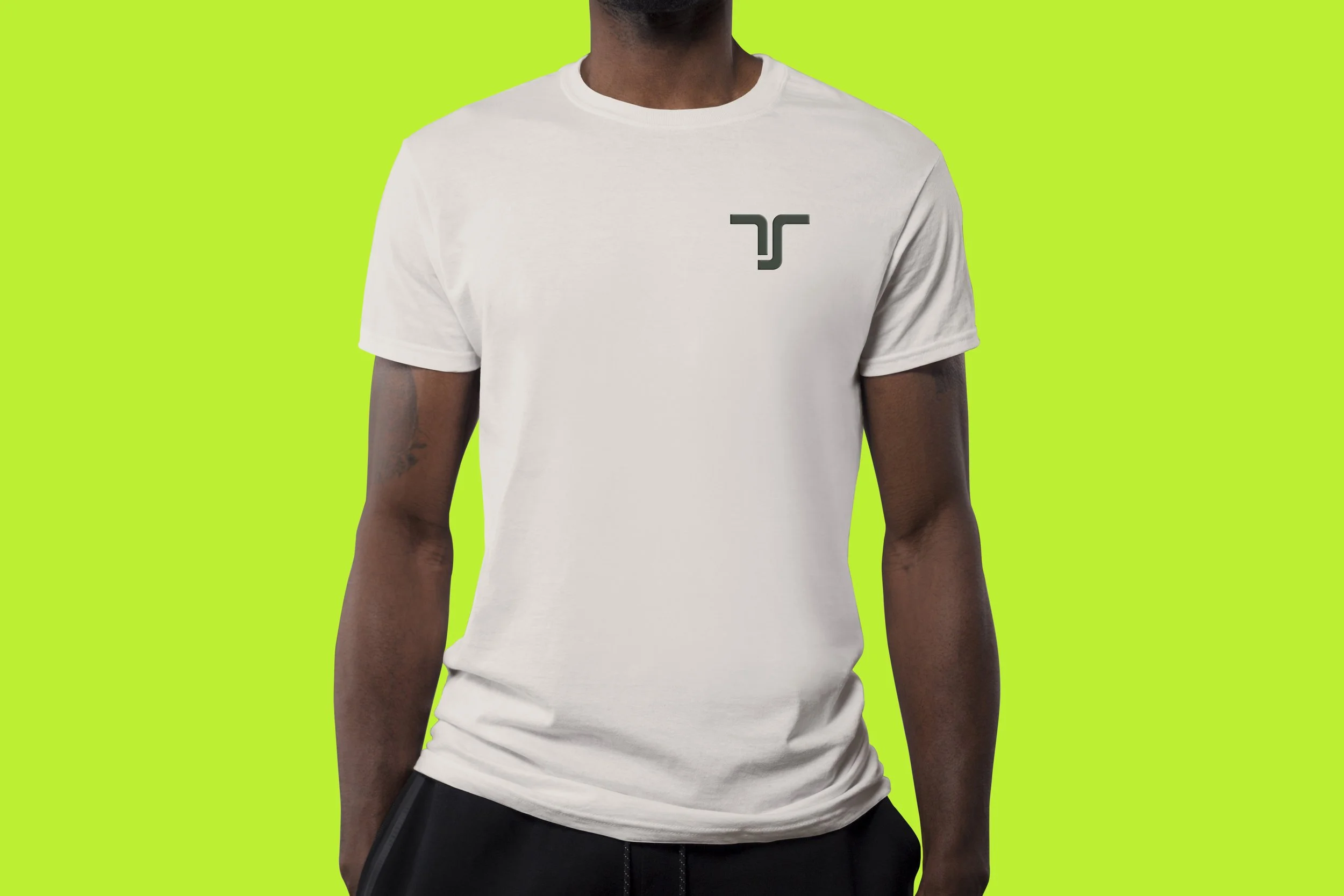
TechSera Branding


Techsera is a technology startup specializing in product development and consulting services within the supply chain ecosystem. In this fast-paced industry, a distinctive brand identity allows the company to remain top of mind while driving innovation. This rebrand sets Techsera apart by showcasing its ethos in an inspiring, creative, and visually compelling way, while also highlighting its commitment to sustainability. The refreshed identity positions the company for long-term relevance and success in an ever-evolving market.
Responsibilities
-
Developed and maintained Techsera’s brand identity, ensuring cohesive visual storytelling across platforms.
Designed logos, typography, and color palettes to create a distinctive and scalable brand presence.
Established and documented brand guidelines, including usage rules for logos, fonts, colors, and imagery.
-
Designed marketing collateral such as website assets, pitch decks, social media graphics, and advertisements.
Created email templates, banners, and infographics to support marketing campaigns.
Designed and optimized UI visuals for Techsera’s website to align with the brand’s aesthetic and functionality.
Developed social media content, including static and motion graphics, to increase engagement.
Created iconography, and user interface elements for Techsera’s digital products.
-
Developed and led a brand platform workshop to define Techsera’s core pillars and strategic needs
Worked closely with founders, engineers, and marketers to align visuals with business goals.
Provided design support for investor decks, presentations, and product launches.
Provided creative direction/guidelines for photo and video shoots to maintain brand consistency.
-
Managed multiple design projects from concept to execution with minimal supervision.
Prioritized tasks and met tight deadlines in a fast-paced startup environment.
Ensured brand consistency across print, digital, and product experiences.


TechSera X
TechSera aims to sustainably create order out of chaos. This philosophy is reflected in the TechSera "X" symbol, which represents the transformation from disorder to structure. The symbol is derived from both the concept of organizing complexity and the "T" from TechSera, reinforcing the company’s commitment to efficiency, precision, and innovation.


Progressive
Approchable


Stable
Openness


Techsera’s color palette establishes an innovative and reliable presence within the supply chain technology space while reinforcing its commitment to sustainability.
TS Olive and Warm Blue create a foundation of trust, stability, and expertise, reflecting the company’s long-term vision and resilience. TS Cream adds warmth and approachability, while Lime Green injects energy, symbolizing growth, renewal, and eco-conscious innovation. Light Blue conveys clarity, transparency, and open communication.
Together, these colors create a balanced and distinctive identity, reinforcing Techsera’s role as a dynamic, future-focused, and sustainability-driven leader in the industry.
Reliable


Completed 2022
Role: Sole Graphic & Brand Designer

Color diversity is essential to TechSera’s visual identity, representing adaptability, innovation, and a modern approach. The TechSera logo can be displayed in any color from the brand palette, as long as contrast and hierarchy are maintained. Ensuring clarity and legibility across various backgrounds and mediums.